Packaging concepts

Post by Sandra

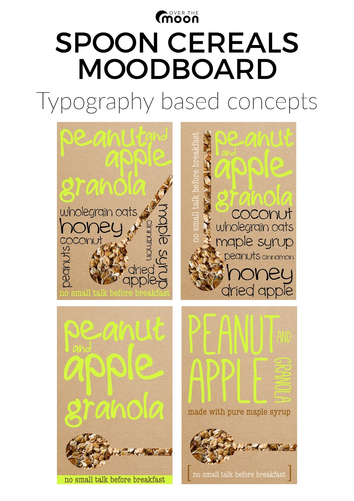
Working with patterns, brown card and black, white and a colour, I produced the following initial concepts. The black spoon could be replaced with Leonie's hand drawn illustration. I plan to create some more concepts over the next week.


Flourish meeting and actions

Post by Sandra

Following our meeting with Flourish and the feedback we received, we have decided to develop further concepts based on these criteria:

Brown card packaging
Small cut out on box
Patterns in black and white (and possibly one colour)
Small scale geometric pattern
Pattern in small area on front, extended around sides/back
Illustration (Leonie)

Colour palette:
Cinnamon & Pecan - red/organge
Apple & Peanut - green
Muesli & Granola - yellow

Leonie is going to refine the Spoon logo she developed, and work on some illustration ideas. Clare and Sandra (and Leonie if time allows) will concept the ideas discussed above.


These concepts will be shared with each other, together with some suggested typefaces on 23/03/16.


Next meeting with Flourish - 13/04/16

We need to have the following completed to discuss at our next meeting:

Branding completed (logo, typefaces, colour palette, supplementary illustrations, patterns)
Mockups of each flavour variant
Web mockups

Conference call with Spoon

Post by Sandra

Annie from Spoon very kindly agreed to talk to us over the phone to answer some of our questions. We were planning to go up to London to meet with Annie but unfortunately due to uni commitments we couldn't make it.

This is a summary of what Annie told us:

Q What are Spoon's brand values?
A Taste is the most important thing, with pure maple syrup and ingredients, reflected in the simple packaging design. Simplicity - a small number of high quality ingredients. It was a definite choice not to make health claims on the product packaging.

Q Who do you see as your target market?
A Young professionals and creatives who are fairly affluent, and are interested in exercise and nutrition as part of a fun balanced lifestyle and who want to look after themselves. Also young mums and other females. They are hoping to expand out of London more, throughout the UK.

Q Who are your main competitors?
A Dorset Cereals, Rude Health, Lizi's. Plus other high-end granolas and mueslis.

Q What led you to chose your current branding and packaging?
A Annie designed the packaging herself (she has a marketing background). Card was chosen as it is recycleable (pouches were originally used but were not recycleable in the UK). Colour was added because a potential stockist suggested the product would stand out better on the shelf. The boxes are robust whereas the pouches often look a bit crumpled.

Q What is the benefit of running your pop-up shops?
A Annie said she originally thought she might open a breakfast cafe/shop but decided her passion was really for granola. The pop ups were really testing the market for the cafe idea. They also work well for participating in lifestyle events with other like-minded brands (not just food companies).

Q What areas do you hope to expand into in the future?
A Spoon has a new product launching in June - a muesli with added granola which has less sugar and more raw ingredients than the granola. They would consider single serving products, porridge pots, yoghurts and compotes. Their passion is breakfast products.

We sent Annie a thank you email and a link to our blog.

It was reassuring to see that our research was confirmed by what Annie told us, particularly in relation to brand values, competition, and target markets.

Concept Moodboards

Illustration based concepts by Leonie

Experiments with the combination of paint and illustration. The plan would be to add further elements later.


Logo Concepts

Post by Leonie

I sketched out some possible logo concepts with a view to developing them further later on.

Early sketches


second stage drawing to be refined later

Concept moodboards

Sandra created the following mood board exploring concepts created with typography to show to Flourish.


Clare created the following mood board exploring concepts created with patterns to show to Flourish.


Conference call

A conference call has been arranged with Annie, one of the Directors of Spoon Cereals, for Friday at 10am.  The questions we plan to ask are:

1. What are Spoon Cereal's brand values?
2. Who do you see as your target market?
3. Is there another group of customers you hope to target in the future?
4. Who are your main competitors?
5. What led you to choose your current branding and packaging style?
6. What is the benefit of running your pop-up stores?
7. In what areas do you hope to expand into in the future? Hot cereals, breakfast bars?
8. Have you got any other ideas in the pipeline? New flavours?
9. What else can you tell us that might help us with our project?


Subscribe